
The Curious Case of Disappearing Logos: Why Brands Are Removing Elements from Their Identities
Brands have simplified their logos. Interestingly, this creates more recall power in today's world. This blogs dicusses why are brands doing this.
5/26/20263 min read
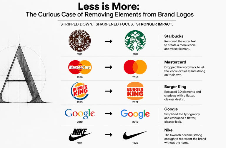
In recent years, some of the world’s most recognizable brands have been doing something counterintuitive: removing parts of their logos. Mascots disappear, text vanishes, intricate details are stripped away, and iconic symbols are reduced to their simplest forms. At first glance, it may seem like a loss of identity. In reality, it reflects one of the most significant shifts in modern branding.
From simplification to digital optimization, the trend of logo reduction reveals how brands are adapting to a world of shrinking screens, shorter attention spans, and global recognition.
From Complexity to Simplicity
Historically, logos were designed for physical media—newspapers, billboards, packaging, and storefronts. Detailed illustrations, ornate typography, and multiple design elements helped brands stand out.
Today, a logo must perform equally well on a smartphone notification, a social media profile picture, a smartwatch screen, and a billboard. Complexity often becomes a liability. The smaller the screen, the more valuable simplicity becomes.
As a result, brands are increasingly embracing minimalist designs that are instantly recognizable across all platforms.
The Power of Recognition
One reason companies can afford to remove elements from their logos is the strength of their brand equity.
Consider how global brands no longer need to explain who they are. A single symbol, color, or shape often triggers immediate recognition.
When consumers already associate a symbol with a company, additional elements become redundant. Removing them can make the brand appear cleaner, more confident, and more modern.
This follows an interesting branding principle:
The stronger a brand becomes, the less it needs to say.
Digital-First Branding
The rise of digital platforms has fundamentally changed logo design requirements.
Modern logos must be:
Visible on small screens
Scalable across devices
Easily animated
Recognizable in app icons
Effective in both color and monochrome formats
Detailed shadows, gradients, and complex illustrations that once looked impressive on print materials often become blurred or unreadable on digital interfaces.
Brands therefore simplify logos to maximize versatility and maintain consistency across every touchpoint.
Examples of Logo Reduction
Several major companies have embraced simplification:
Starbucks gradually removed surrounding text and focused solely on its iconic siren.
Mastercard eliminated its brand name from many applications, relying on the overlapping red and yellow circles.
Burger King abandoned glossy effects and returned to a cleaner, flatter identity.
Google simplified typography and adopted a flatter visual language aligned with digital interfaces.
Each redesign removed visual complexity while preserving recognizability.
The Psychology Behind Simpler Logos
Research in consumer psychology suggests that people process simple visual information faster than complex information.
A cleaner logo offers several advantages:
Faster recognition
Better recall
Greater adaptability
Modern perception
Improved user experience
In an environment saturated with information, simplicity becomes a competitive advantage.
The Risks of Going Too Far
However, simplification is not without danger.
Some redesigns have faced criticism for making brands appear generic or interchangeable. When every company adopts flat typography and minimalist symbols, distinctiveness can suffer. A logo's purpose is not merely to look modern; it must remain uniquely associated with the brand. Excessive simplification can dilute personality and heritage.
The challenge lies in removing what is unnecessary while preserving what makes the brand memorable.
A Strategic Signal, Not Just a Design Choice
Logo reduction is often interpreted as a design trend, but it is fundamentally a business strategy. By removing unnecessary elements, brands signal confidence in their recognition, adapt to digital environments, and improve consistency across customer touchpoints. What appears to be subtraction is often the result of sophisticated strategic thinking: understanding what consumers truly remember and eliminating everything else.
Final Thoughts
The disappearance of elements from modern logos reflects a broader truth about branding: success is not always about adding more. Sometimes, it is about identifying the few elements that matter most and allowing them to stand on their own.
In an age of information overload, the most powerful brands are often those that communicate the most with the least.
What do you think? Has logo simplification made brands stronger, or are companies sacrificing uniqueness in the pursuit of minimalism?
Intellect Avenue
Explore articles that foster positive change.
intellectavenue24@gmail.com
© 2026. All rights reserved.